UI foundation
Tables and listings
Laravolt v8 uses Suitable and generated table classes for searchable, paginated admin listings.
A table should keep listing logic in one place: query, columns, search, sort, pagination, and row actions. Blade should describe the page structure, not rebuild table behaviour by hand.
When to use a table
Use a Laravolt table when users need to:
- browse many records
- search or filter by common fields
- sort operational lists
- paginate consistently
- expose row-level actions such as view, edit, approve, archive, or export
For a small static list, normal Blade markup is fine. For a growing admin resource, start with a table class early.
Generate a table class
php artisan make:table ProductTableThe current generator creates a table class and prints a Blade usage hint. Verify the generated namespace and component tag in your application before documenting it in project-specific prompts; the expected usage usually looks like:
<livewire:table.product-table />Use the generated class as the home for query and column decisions. That keeps the view small and makes the listing easier to review.
Render a table on a page
A typical listing page puts the table inside the platform layout and keeps page actions in the action slot:
<x-volt-app title="Products">
    <x-slot name="actions">
        @can('create', App\Models\Product::class)
            <x-volt-button href="{{ route('products.create') }}" variant="primary">
                New product
            </x-volt-button>
        @endcan
    </x-slot>

    <livewire:table.product-table />
</x-volt-app>
Authorization still belongs on the route/controller. Hiding the button is user experience, not the security boundary.
Suitable builder API
For simple listings, Suitable can render directly from a collection or paginator:
use Laravolt\Suitable\Columns\Text;
use Laravolt\Suitable\Columns\DateTime;
use Laravolt\Suitable\Facade as Suitable;

{!! Suitable::source($products)
    ->title('Products')
    ->search()
    ->columns([
        Text::make('name', 'Name')->sortable(),
        Text::make('sku', 'SKU')->sortable(),
        DateTime::make('created_at', 'Created at')->sortable(),
    ])
    ->render() !!}
source() accepts the data to render. When the source is a paginator, Suitable can render pagination through the configured table view. Keep advanced builder helpers close to the table class and verify exact helper names against the installed Suitable version before publishing app-specific conventions.
Column choices
Suitable ships focused column classes for common admin lists, including text, number, currency, boolean, date, datetime, image, URL, HTML, view-backed cells, buttons, dropdown actions, row numbers, and relationship display.
Prefer explicit column classes when behaviour matters:
Text::make('name', 'Name')->sortable();
Currency::make('price', 'Price');
Boolean::make('is_active', 'Active');
Use raw HTML or custom view columns only when the cell needs presentation that cannot be expressed by the standard columns.
Search, sort, and pagination
Keep database-aware search and sort behaviour close to the table class. Avoid filtering records inside Blade after the query has already run.
A practical pattern:
- Build the base Eloquent query.
- Apply search/filter request input in the table class.
- Paginate the query.
- Pass the paginator to Suitable.
- Let Suitable render pagination and table chrome.
This gives reviewers one obvious place to inspect list behaviour.
Tables on phones
Below 568px wide, Laravolt shows a table as a stack of cards. Each row becomes a card, and each cell is labelled with its column heading. This uses Basictable, which ships with Laravolt and is loaded by @laravoltStyles and @laravoltScripts.
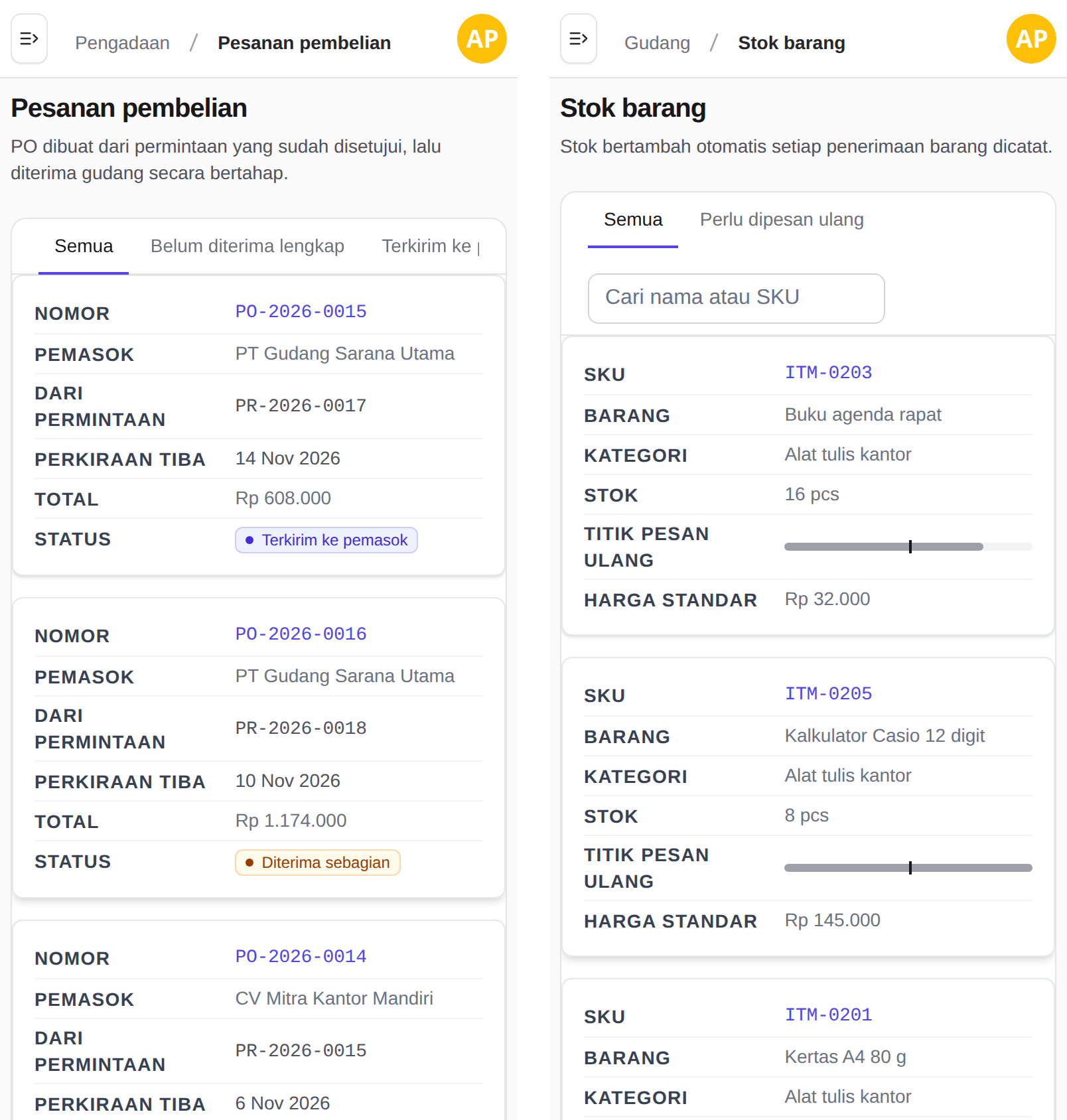
Generated table classes (make:table, rendered by Laravolt\Ui\TableView) get this automatically. For a table you write yourself inside <x-volt-app>, add the basictable class. The base layout already runs @basictableInline('.basictable'):
<table class="basictable w-full text-left text-sm">
    <thead>
        <tr>
            <th>SKU</th>
            <th>Item</th>
            <th class="hidden md:table-cell">Category</th>
            <th><span class="sr-only">Reorder point</span></th>
        </tr>
    </thead>
    <tbody>
        {{-- one <tr> per record --}}
    </tbody>
</table>- Every column needs a heading. The card labels come from the
<th>text. For a column without a visible heading, such as a progress bar, put the label in asr-onlyspan. - Columns hidden on small screens come back in the card. A cell with
hidden md:table-cellis shown on a phone, because the card has room for it. - Undo sizes meant for the wide table. Cells with
w-40,max-w-64ortruncatestay narrow inside a card. Reset them in your CSS:
.bt-wrapper table.bt tbody td {
    width: auto;
    max-width: none;
    white-space: normal;
}- Colours and theme carry over. Badges and coloured values keep their colours, and the cards follow the app's light or dark theme (Laravolt 8.2.2 and later).
Other card styles
To give a table another card style, use a different class and call the directive yourself, after the table. The .basictable class already gets the inline style from the base layout.
| Directive | Card style |
|---|---|
@basictableInline('.selector') | Label beside the value (the layout default) |
@basictableResponsive('.selector') | Label above the value |
@basictableCompact('.selector') | Label above the value, with less padding |
@basictableScrollable('.selector', '300px') | Cards in a box that scrolls past the given height |
@basictable('.selector') | Basictable's own defaults |
Each directive takes an options array as its last argument, merged over its defaults. Arguments can be variables:
@push('script')
    @basictableResponsive('.stock-table', ['breakpoint' => 768])
@endpush
Options include breakpoint (in pixels, default 568), containerBreakpoint, tableWrap, showEmptyCells and header. Options work from Laravolt 8.2.4.
Row actions
Row actions should use named routes and policy checks:
@can('update', $product)
    <x-volt-button href="{{ route('products.edit', $product) }}" variant="secondary">
        Edit
    </x-volt-button>
@endcan
For destructive actions, prefer POST/DELETE forms with CSRF protection and backend authorization. Do not rely on hiding a dropdown item as the only control.
AI-ready table conventions
When asking a coding agent to add or change a listing, include:
Use a generated Laravolt table class for Product.
Keep query/search/sort logic out of Blade.
Use Suitable columns where possible.
Add policy checks for row actions.
Add a feature or browser smoke test for the listing.
Mark uncertain Suitable APIs as TODO: verify API.
A table is easier to modify safely when the columns, query, permissions, and view are not mixed together.
What to read next
- Admin workflows — combine lists, forms, and actions into resource workflows.
- Access control — protect row actions and menu entries.
- Artisan commands — command reference for
make:table.